Tags
art, Broadside, intaglio prints, Letterpress, pop-up, Printing, typography
First off, the website has recently been updated and is now fully functional again after over a year in cyber limbo!
I will be in New York in just a week on April 5th to once again be part of the Manhattan Fine Press Fair. Our usual location at The Church of St. Vincent Ferrer, 869 Lexington Avenue. Just across the street the Antiquarian Booksellers Association of America is hosting the largest antiquarian book fair in the world at the Park Avenue Armory. Join me and many other private presses, book artists, makers and takers from around the world. And good news, after 11 years the church/school is letting us use the gymnasium which purportedly has windows! Please let me know if you hope to attend, I can add you to my will-call list.
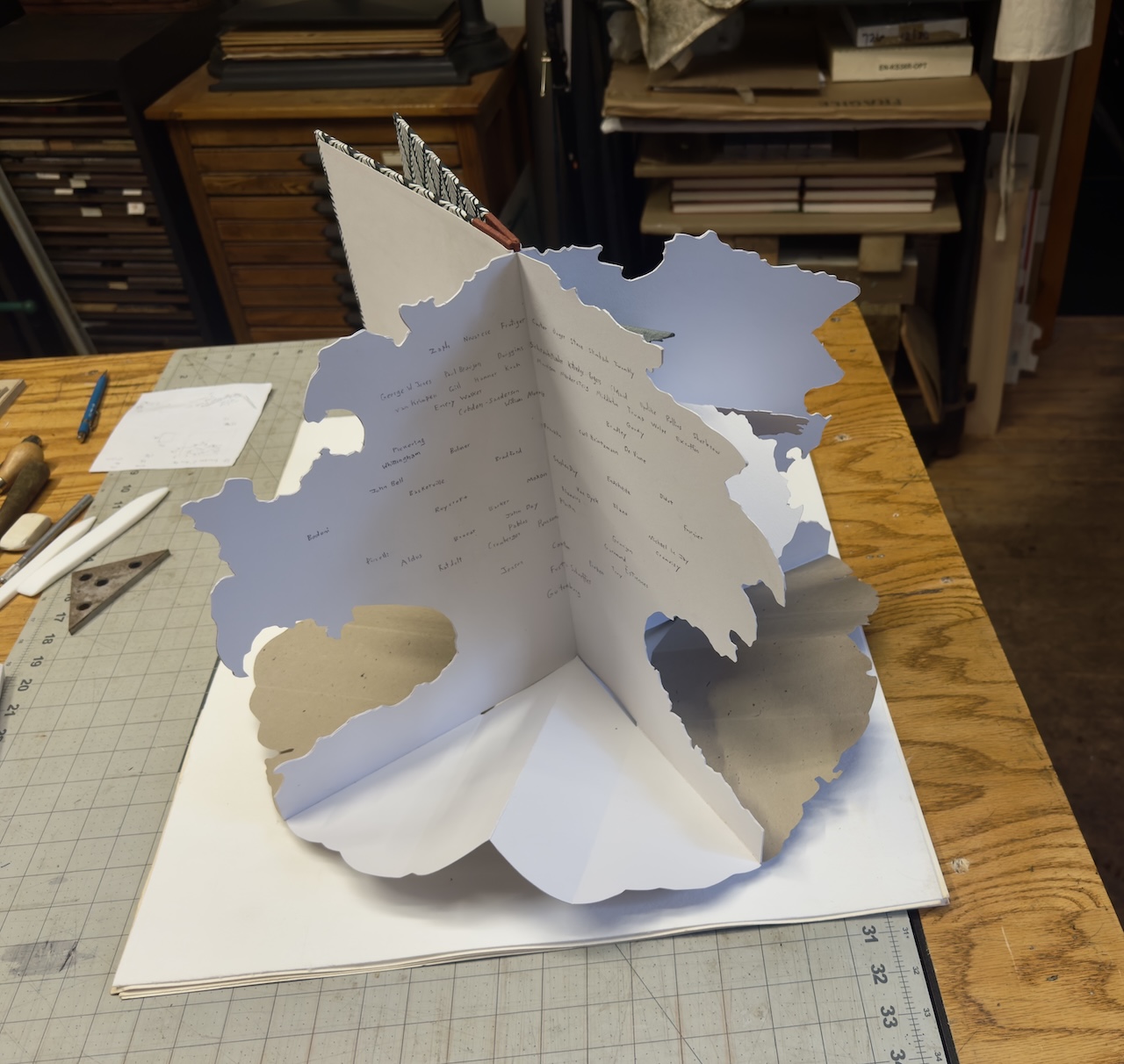
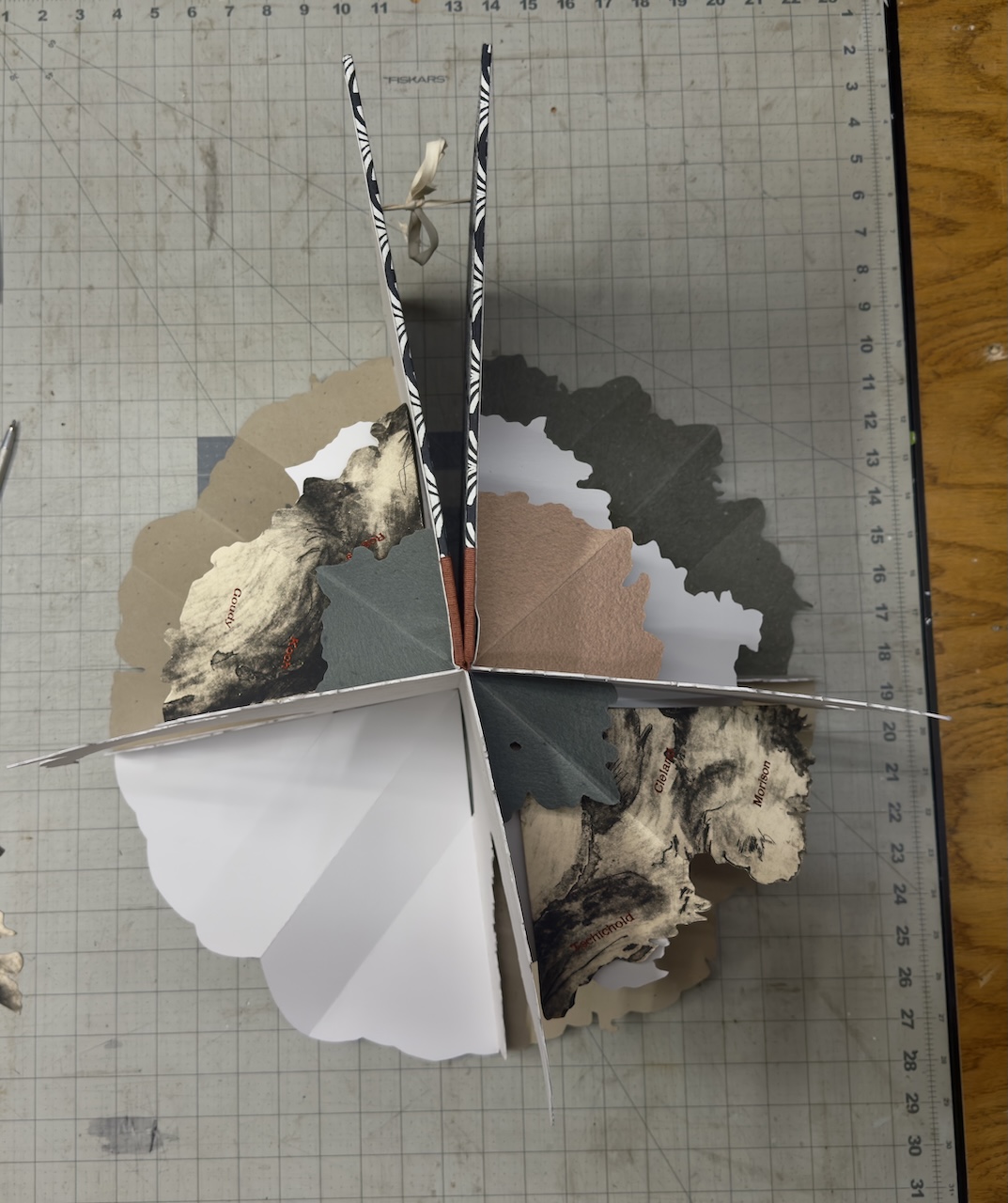

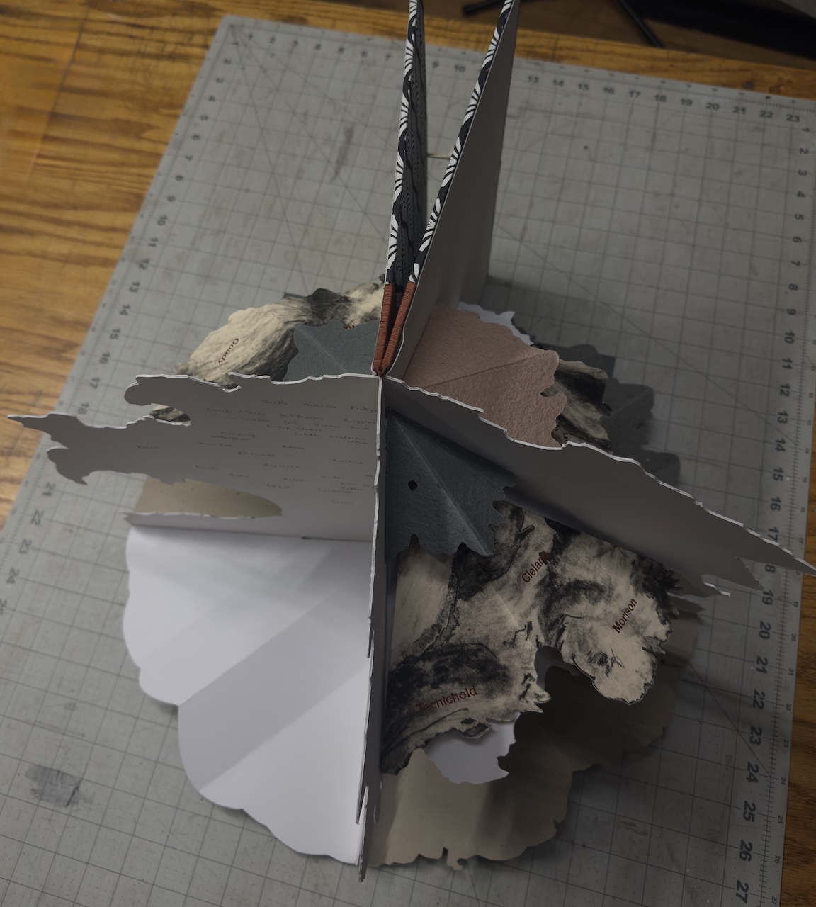
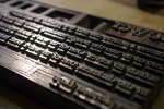
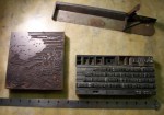
I’m excited to bring along a new project which has been boiling away in the back of my brain for over a decade as I worked on the logistics – A Printers Family Tree – from Gutenberg to Zaph with some paper engineering! Thirty years ago I did all kinds of this sort of thing as individual projects but I’m committed to edition at least 10 of this new piece. I’m still working out paper weights for different pieces but all the elements will be created from intaglio prints – both new mono prints and culling from my vast collection of too many plate proofs and states from my earlier engravings and mezzotints. The names are foil stamped from brass type in this prototype but I will create slugs on my Linotype machine in Garamond for the final impressions. I’ve worked out the binding structure but the boards will remain relatively plain in paper and cloth for flexibility and because they won’t be visible when displayed. The book will be housed in a case as it still won’t sit like a proper book when closed.
The spread that is just penciled in with names will have pop-up elements as well but I’ve left this “editable” as I’m hoping I’ll have plenty of feedback on my choice of whom to include in my list of prominent type designers. Though I have a laser cutter/engraver all these are/will be hand cut to follow the inevitable irregularities the intaglio prints and mono prints have to offer in the trunks and foliage and to allow flexibility foiling the names on each panel with the jig I’ve created for my foil stamping machine.
Looking over exhibitors at our “fine press” book fairs – a majority are now book arts. Two different things in my mind and kind of a dilution of the real work. I do miss the old days of the FPBA before the flailing organization opened up it’s definitions of fine press. If you can’t beat them, join them. What do you think of these evolving definitions?
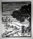
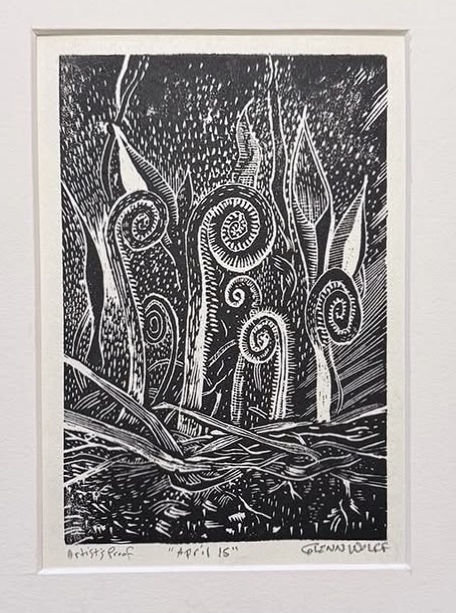
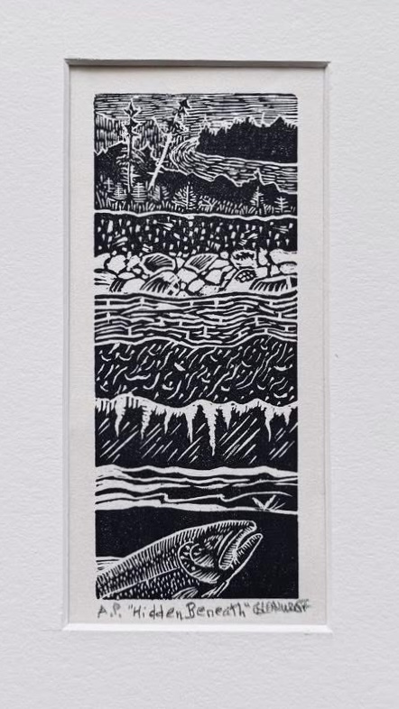
Other current projects are a new book with essayist/poet Jerry Dennis and our mutual friend and frequent collaborator, Glenn Wolff, is once again illustrating with wood engravings. Jerry, Glenn and I have done multiple projects together over the past couple of decades and it’s always fun to work out a new project – Mornings at Jackpine is a collection of verse and an essay contemplating the turning of seasons in our physical world and the cycle that is our existence. Jerry’s essays, poems, and short fiction have appeared in more than 100 publications, including The New York Times, Smithsonian, Audubon, American Way, Gray’s Sporting Journal, PANK and Michigan Quarterly Review. His books are widely acclaimed, have won numerous awards, and have been translated into Chinese, Japanese, German, Portuguese, Czech, and Korean.
Some of Glenn’s engravings for the project:

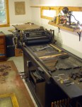
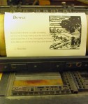
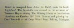
Another recent collaboration with Jerry and Glenn is a series of broadsides to benefit Michigan libraries that are facing defunding, book banning or reduced services and hours. The first print is available now via the Peter White Public Library in Marquette, MI. “A Passion for Books” is printed on 300-gram Somerset textured cotton paper, measuring 15 x 11 inches. The text is composed in Garamond and printed letterpress on a Vandercook 219 OS.
We are working with the Library of Michigan and other entities to see how we can bring this and the 3 additional prints we plan to add to the series to more libraries across the state. I’ll happily crank my Vandercook for a day or two to do what I can to support our libraries.

Two editions are available:
· Special Roman-Numbered Edition: Limited to 20 pieces, hand-colored by Glenn Wolff, and signed by Jerry Dennis, Glenn Wolff, and Chad Pastotnik. Available for tax-deductible contributions of $500 or more.
· Open Edition: A signed two-color print available for tax-deductible contributions of $100 or more.
Order by clicking the “Donate” button at https://pwpl.info/giving/ and in the payment processing page scroll down to the broadside option of your choice. Payments can be made via debit card, credit card, or PayPal. If you would rather use check or credit card over the phone, contact Heather Steltenphol, Development Director at Peter White Public Library, at 906-226-4305 or via email at heather@pwpl.info.
Another recent philanthropic project is a broadside completed for The CODEX Foundation’s 5th Assembly/Exchange Portfolio – The Art of Translation. Further announcements and details forthcoming from CODEX for this 2025 release but I will share these images of my contribution during production with hopes some of you will be interested in acquiring it with the rest of the portfolio upon its release in a beautiful box along with probably 20-40 of my contemporary peers from around the globe. I was happily paired with David James Duncan to produce his piece “One River” for the first Assembly/Exchange in 2019.


Another project in its infancy is large in scope but has begun to form up is my series of Midwest author books which Mornings at Jackpine will kick off. In addition to the fine editions I produce, a second state will be offered on Mohawk paper and a simple binding structure which I will print on my Little Giant press allowing me production speed unheard of with my hand cranked cylinder proof press and I’ll pass the time and cost savings along to those of you who love the books but can’t justify the expense (I get it, I really do.) I’ve worked out everything but the marketing but that’s never stopped me before! I’ve also created a new partnership to edit this series of books but this will all be gone into in depth in a future blog post. This is another aspect of Deep Wood Press I’ve been wanting to explore more and have given a lot of thought to in the past decade. I will continue to issue fine editions of great books from the past that have touched and inspired me but my heart is in new writings, upcoming authors and translations and that’s the direction I see things moving forward with the greatest energy.
Ok, that’s a lot for one blog post. I’ll let it digest and get back to you in the next 6 months.
One last note. The stupid AI on WordPress tells me my words and sentences are too complex for most readers and that some of the words I use don’t even exist. If you’ve made it this far – welcome to the minority!