• Home
  • About
  • Gallery ~ Books, broadsides and ephemera
  • Studio Rental, Residency & Instruction

Chad Pastotnik, Deep Wood Press

~ Fine letterpress and intaglio printing ~ Celebrating 30 years in 2022

Chad Pastotnik, Deep Wood Press

Category Archives: Printing

A Broadside for Terrance Hayes ~ process

01 Saturday Nov 2014

Posted by Deep Wood Press in Broadsides, Education, Letterpress, Printing

≈ 1 Comment

Tags

Broadside, Chad Pastotnik, frustration, Letterpress, linocut, Terrance Hayes, typography

I’ve admired the poetry of Terrance Hayes since a friend recommended him a couple of years ago so when I got word he was coming to my part of the world I took note, and made a few inquiries. I had done a broadside for Robert Hass when he came to Interlochen Center for the Arts in 2006 so had already set a precedence for the project to happen and they were very receptive. Then the game of working with an author and their publisher on a short schedule for selection and proper clearance began!

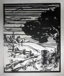
I was sent the piece Bower which is excerpted from the poem Arbor for Butch in the book Lighthead. I was familiar with the poem as a whole and struggled with what sort of art or ornamentation this fragment of a poem should/could have accompany it. In the end I decided to let these four lines of text stand on their own and this was probably influenced by the fact that I had a linocut I’d done but hadn’t used for anything “bookish” yet which fit well with the poem especially after hacking a bit off the top of the block. Also, time was short, I had to work with materials and paper I had on hand, no time to order anything in.

finsigned2

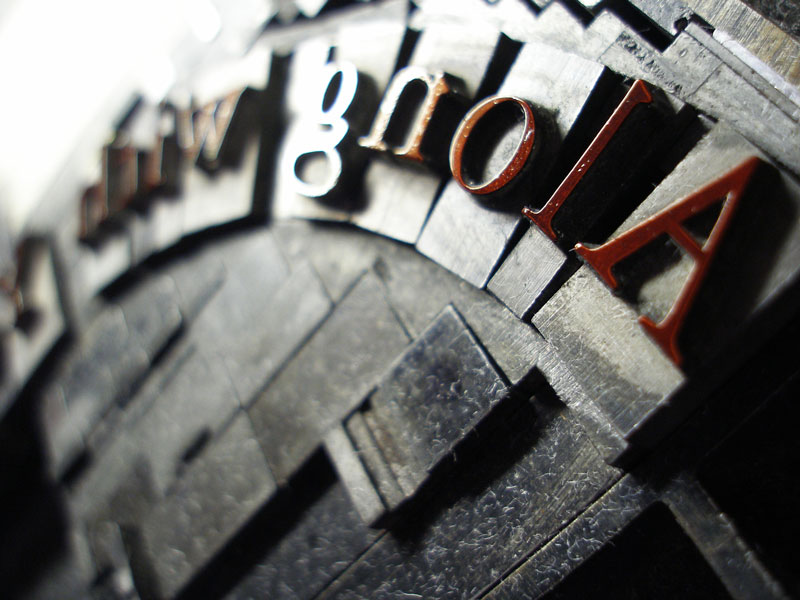
So here it is as it turned out. Three colors on mould-made German Zerkall Frankfurt cream paper, 15 x 8.5 inches, hand set in Garamond in 24 and 72pt type and printed on my Vandercook 219OS with an additional bit of text on the back commemorating the evening and credits. The paper was not ideal, it is a beautiful sheet but the pronounced laid lines from the mould made printing the solids on the linoleum block quite difficult solved by being diligent with ink, a soft packing and running the sheet through the press twice. The Frankfurt paper was the only nice stock I had in enough quantity to do 100 broadsides so the dimensions of the broadside were more or less dictated by how the sheets could be divided and since it had such a lovely deckle edge from the mould, 100 is a small enough quantity to tear down by hand.

From the beginning I planned on the text running into the linocut so had made paper cut outs of the proofed text and moved it around with prints pulled from the linocut to plan my composition. I printed the lino first but now, to my eye, I feel the text crowds the image and would have benefitted from being moved a bit further away but stubbornly decided to keep my left margin equal − these are the hazards of only having a couple of days to devote to something. I prefer to have various proofs just hanging around the studio for a few days or a few weeks to look at. It’s fast enough to put some ink on the slab bust out a brayer and tweak the print or play with word spacing in the type, add leading, move elements around and “play”.


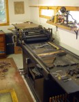
My approach on book and typographic composition comes from my fine art background first where typically a painting or print evolves over a period of time. Blocks of text are tones of color or shades of grey, how they work with whatever other non-typographic elements might be present and the space of the page spread and the overall book design. My early books were far more “experimental” with type I think but not always in a good way, so much forever to learn. I have an advantage, I think, in my book production because I do every part of the process here – I envision the whole of the book from the beginning from material selection to what the cover will look like. Knowledge of paper and bookbinding informs much information on creating the page layout and selection of stock for accompanying art, doing the artwork for the project gives me flexibility in design, and there is no reason why anything can’t change as the project progresses.

this is analog design.   this is letterpress.


For those who don’t know, (taken from Wikipedia) Terrance Hayes first book of poetry, Muscular Music (1999), won both the Whiting Writers Award and the Kate Tufts Discovery Award. His second collection, Hip Logic (2002), won the National Poetry Series, was a finalist for the Los Angeles Times Book Award, and runner-up for the James Laughlin Award from the Academy of American Poets. He won the National Book Award for Lighthead.

Hayes poems have appeared in literary journals and magazines including The New Yorker, The American Poetry Review, Ploughshares, Fence, The Kenyon Review, Jubilat Harvard Review, West Branch, and Poetry.

In September 2014, he was honored as one of the twenty-one  2014 fellows of the John D. and Catherine T. MacArthur Foundation – one of the most prestigious prizes that is awarded for artists, scholars and professionals.


Share this:

  • Share
  • Click to share on Twitter (Opens in new window)
  • Click to share on Facebook (Opens in new window)
  • Click to share on LinkedIn (Opens in new window)
  • Click to share on Tumblr (Opens in new window)
  • Click to share on Pinterest (Opens in new window)
  • Click to share on WhatsApp (Opens in new window)
  • Click to email a link to a friend (Opens in new window)

Like this:

Like Loading...

A Return to Process and Dialogue

11 Saturday Oct 2014

Posted by Deep Wood Press in Books, Education, Equipment, Letterpress, Oak Knoll Fest, Printing

≈ 6 Comments

Tags

book arts, Chad Pastotnik, Deep Wood Press, education, Letterpress, Linotype, Oak Knoll Fest, Printing

First off, having recently returned from a most encouraging showing of my books at Oak Knoll this past week, I must say thank you to many who have followed this blog and whose friendships I continue to make and cement in the “real” world. I was amazed how many mentioned reading this or the social media bits of DWP’s online presence and I feel I must apologize for this blog having turned more into a PR tool or travelogue. It was my intention from the beginning for this to be more about process and dialogue. So let’s begin again and I will attempt to stay more on track though I will still mention new work or events but direct you to other sources for more details. This will be a somewhat longer post to get things rolling.

type hand-set on a curve

type hand-set on a curve

Dialogue – what is letterpress printing?

At these events and exhibits I have the pleasure of the company of fellow printers as well as a cultivated relationship with private and institutional collectors of my books. It is with interest I have noted a recurring theme of discussion which has been raging in the fine press world for over two decades but it seems the buying public is just starting to wonder: What is letterpress printing? Allow me a couple of paragraphs to cover the general process and history, neither exhaustive or fully concise:

  By definition I suppose it is printing from a relief surface via letterpress. Letterpress is a term that has only come into existence really in the past 50 years and has morphed into both verb and noun use. Prior to this time it was the only widely used reproductive process as innovated by Gutenberg in the 15th century and it was merely “printing” and those who printed were “Printers” Today, those of us who continue the tradition, draw on this legacy for better or worse.

  Gutenberg’s legacy is that of the matrix from which type is cast in a mould. Type is something you can pick up with your fingers and compose into words, form sentences, paragraphs and pages with. It is the famous “26 soldiers of lead” which conquers ignorance and tyrants. Type remained in this form until the late 19th century when machine composition became a possibility with the technology and resources made available by the industrial revolution and manifested by Monotype composition casting equipment and the Linotype and Intertype line casting innovations. Both of these new means of putting words into page form allowed for composition to be done via a keyboard and then cast into type metal from that action to form the composed page. With this innovation and increase in production some compromise was made in typography as compared to hand composition but refinements could be used to help negate and bridge the narrow gap. This technology remained in place essentially until the 1980’s with the advent of the ease of modern desktop publishing with the dark days of film composition enjoying a thankfully brief stay in the 60’s-70’s.

So why is the question being asked now – what is letterpress printing? What is new now and not part of the 500-year-old tradition of printing is the advent of polymer plate printing. Arguably this technology is what may have saved letterpress from near death and made it accessible and popular with small presses offering wedding invitations, business identities, packaging, ephemera and – books. Printing from plates is relatively easy and they are created predominantly on computers. No knowledge of the history or the art of printing is necessary nor are many of the skills ingrained in producing printing with metal types needed.

Nearly everyone with a computer can compose text, add illustration and even make a book. True also that anyone given a box of paint and a brush can paint a picture. The quality of the product created is the sum of the individual’s understanding of the process, their artistic abilities, level of craftsmanship and, I would add, their understanding of the history of their craft and those who shaped it. There are countless programs now in higher education across the US, the UK and beyond teaching letterpress and book arts courses in degree programs and, thankfully, almost all of them start teaching students the basics of hand typography – assembling type you can pick up from cases and composing the project as has been done since Gutenberg. The polymer machine sits in the corner biding it’s time and offering sweet promise of relative ease and speedy efficiency to be utilized later.

I fully acknowledge that now, at this point in time, it is very difficult to assemble a letterpress shop. The machines, fonts of type and supporting industry revolving around letterpress ceased to exist in the 60’s for the most part. Twenty two years ago when I started printing book forms I received the bulk of my equipment for free or little money merely to make room in more progressive established print shops for more storage or that new all-in-one color laser/dye sub/inkjet thing that did 90% of what their customers wanted. What is left now of the equipment is often quite expensive to purchase and, while type still exists, it is not the sturdy foundry type of the days of old and still commands a premium prices as well. Printing from plates also has the potential of producing work of the highest quality indistinguishable from metal type except maybe for being “too perfect” – not a guarantee but full potential if used by a typographer and designer skilled in better than average desktop publishing software.

linotype and hand set composition on the press
hand set type form on press
polymer plate going on a press

WHAT IS LETTERPRESS PRINTING?

Is it merely printing from a raised surface? Or is it more?

What is it to you? To what do you give value?

Share this:

  • Share
  • Click to share on Twitter (Opens in new window)
  • Click to share on Facebook (Opens in new window)
  • Click to share on LinkedIn (Opens in new window)
  • Click to share on Tumblr (Opens in new window)
  • Click to share on Pinterest (Opens in new window)
  • Click to share on WhatsApp (Opens in new window)
  • Click to email a link to a friend (Opens in new window)

Like this:

Like Loading...

Diana Gabaldon keepsake completed

06 Sunday Jul 2014

Posted by Deep Wood Press in Broadsides, ephemera, Letterpress, Traverse City National Writers Series Authors

≈ 3 Comments

Tags

Broadside, Chad Pastotnik, Diana Gabaldon, Letterpress, Outlander book series, Printing

Finished the Diana Gabaldon broadside. 13×10″ sheet size, 2 colors. Additional bit of a tag line and credits tastefully printed on the back side. I had to print 200 of them as the event has been sold out. I wish I would have had more lead time on this and could have acquired type or had a plate made to composed the main display font in a more historically accurate font like Caslon but some beat up Americana will have to do, only off by about 200 years…


Diana Gabaldon keepsake

The Diana Gabaldon keepsake for the NWS event in Traverse City, July 7, 2014.

Post Event thoughts

A little update after last nights event. I don’t always like meeting authors or listening to them speak in public about their work but this was an exception. Diana is a genuine and real human being that, despite her amazing and deserved success, came off with wit and honesty about her process and was very engaging to the audience. She also liked the broadsides and was pleased with the additional copies I made for here on the nicer paper stock. It was a capacity sold out crowd at the Traverse City Opera House. I arrived late (of course) and was stunned to see the line for the door wrap around the block – that doesn’t happen in Northern Michigan very often. We got in, delivered the broadsides and settled for balcony seats which was pretty much all that was left. I always feel a little bad about the extra printed items I make for these events as then it is just one more thing that the author might be expected to sign but Diana was very gracious and stuck it out until the end of the line.

My wife and I got out early with still a long line behind us and went for dinner nearby. As serendipity and as luck would have it Diana, Doug Stanton and a few other people ended up at the same restaurant and asked us to join them, very nice end to the evening though already late. Ouch, how much do you pay your baby sitters? Not the best of pics here from the phone camera:

Diana Gabaldon being given the key to Traverse City
Diana Gabaldon and Chad Pastotnik
Diana Gabaldon

Share this:

  • Share
  • Click to share on Twitter (Opens in new window)
  • Click to share on Facebook (Opens in new window)
  • Click to share on LinkedIn (Opens in new window)
  • Click to share on Tumblr (Opens in new window)
  • Click to share on Pinterest (Opens in new window)
  • Click to share on WhatsApp (Opens in new window)
  • Click to email a link to a friend (Opens in new window)

Like this:

Like Loading...
← Older posts


Visit the main website at deepwoodpress.com to join the mailing list and to purchase available books and broadsides.

Enter your email address to follow this blog and receive notifications of new posts by email.

Join 627 other subscribers

Categories

Cover for The Changeling's Exile
The Changeling’s Exile
IMG_3901
img_6380
open box
MoonTitle
spine title
Page spread from The Frogs Who Wished A King by Aesop, versified by Clara Dotty Bates.
Tree (1991)
a pile
a pile
Deluxe Mad Angler Poems
Deluxe copy of The Path
Spread from Heart of Darkness
IMG_6027
img_010373-1
Opening spread from Changeling's Exile
IMG_6035
img_6376
Some books produced at Deep Wood Press
Some books produced at Deep Wood Press. The John Barth book “Browsing” was printed here at DWP for The Literary House Press (Washington College, MD) by James Dissette, my sometimes partner in crime in printing for Chester River Press.
kirkcover
Deluxe copy of The Changeling's Exile
1,000 Artist's Books
1,000 Artist’s Books
Wind prom
Glenn's intaglio plate
Glenn’s intaglio plate
If detail
A printed sheet next to the type form
Title page from Killing the Bear by Judith Minty
IMG_7440
"The Intruder" cover
Messing about in boats
img_7436
Presentation binding for The Chesapeake Voyages of Captain John Smith
Deluxe copy of The Intruder
fanned book
Deluxe copy of The Path
IMG_7418
Deluxe copy of The Intruder
scripta2-l
Cover of The Frogs Who Wished A King by Aesop, versified by Clara Dotty Bates.
Deluxe copy of Heart of Darkness
Center Spread
Center Spread
troutsm
Deluxe Mad Angler Poems detail
Deluxe copy of The Intruder
IMG_6040
Hand set type and border material for Deep Wood Press promotional item.
drinky coaster
intruder-calf-low
JPEG image-E3D0B7CFE94E-1
Where_they_rund
opening spread for the Frogs Who Wished A King by Aesop
Opening spread for the Frogs Who Wished A King by Aesop, intaglio engravings by Chad Pastotnik.
IMG_6015
Pile of books
Pile of Intruders
"The Intruder" cover
The Intruder
intruder-calfspinelow
The Mad Angler's Manifesto
The Mad Angler’s Manifesto
IMG_6061
CD packaging
CD packaging
intruder-calf-low
smithtitle
If
If
img_010339
type hand-set on a curve
final print comb 5
MAonbox
The Frogs Who Wished a King
The 6th etching for the book, "Entitled"
The 6th etching for the book, “Entitled”
Deluxe Mad Angler
coverspread
front cover
Caxtonupspine
Page spread from The Frogs Who Wished A King by Aesop, versified by Clara Dotty Bates.
intruder-erin-low
mosters title page
Title page for the book There Be Monsters
the process
the process
deluxe binding of The Intruder
the linoleum blocks for "The Path" center spread
the linoleum blocks for “The Path” center spread
Saturnalia
Saturnalia
smithspinebx
Don Etherington binding of The Intruder
IMG_0805
kirktitle
Killing the Bear by Judith Minty
Killing the Bear
Opening spread for There be Monsters
prototype for deluxe edition of "The Intruder"
Deluxe edition prototype
hodspine
Custom bound journal, commissioned work
Custom bound journal, commissioned bindery work
Title Page
Title Page
The Path
The Path
The Trout in Winter
The Trout in Winter
cover
TreeAngle
title page from Heart of Darkness
Title page from Heart of Darkness
spine label detail
spine label detail
img_6385
Kafka page spread detail
Trout spread
Trout page spread
Bower by Terrance Hayes
JSspread
Opening spread for Minisens
path2-l
Glenn's remark
Glenn’s remark
intruder-trout-low
Chained books at Chetham's Library in Manchester, England where I was a keynote speaker at a letterpress conference.
Chained books at Chetham’s Library in Manchester, England where I was a speaker at a letterpress conference.
top
Heart of Darkness by Joseph Conrad, regular edition binding
Heart of Darkness
Tedprize
img_010375
Don Etherington binding of The Intruder
Along with Youth by Ernest Hemingway broadside
Along with Youth
Badger c
smithcolormap
Killing the Bear by Judith Minty, deluxe edition binding & slipcase
Deluxe copy of Heart of Darkness
Green Man (1994)
Ripping Oblivion
Ripping Oblivion
cover shot
scripta-l
Cover for the book There Be Monsters
There Be Monsters.
Cover detail
detail of “The Intruder” cover
wordpress visitor counter

blog stuff

  • Register
  • Log in
  • Entries feed
  • Comments feed
  • WordPress.com

Book lovers

  • John Voelker Foundation
  • Fine Press Book Association An organization of individuals interested in the art of fine printing, formed with the goal of promoting the appreciation of beautiful books and printing skills.
  • Books and Vines Musings on Classic Literature, Collectable Books, Fine Wines and a Sundry Other Things that Make Life Interesting.
  • Wood Engravers' Network Since 1994, a group of printmakers, especially interested in wood engraving, have gathered and formed an organization called the Wood Engravers’ Network.
  • The Book Blog A blog dedicated to collectible books by fine presses & other specialty publishers.
  • Deep Wood Press website

Book Bindings Books Breon Mitchell - Franz Kafka Broadsides CODEX Equipment Fine Press Book Association Future Projects In the Penal Colony Letterpress Linotype Mad Parrot Press Manhattan Fine Press Book Fair Moon as Bright as Water Oak Knoll Fest PR and Media releases Printing The Hunter Gracchus The Intruder The Mad Angler's Manifesto The Path The Wind in the Willows Trout Vladimir Zimakov Workshop

On Facebook:

On Facebook:

Create a website or blog at WordPress.com

  • Follow Following
    • Chad Pastotnik, Deep Wood Press
    • Join 169 other followers
    • Already have a WordPress.com account? Log in now.
    • Chad Pastotnik, Deep Wood Press
    • Customize
    • Follow Following
    • Sign up
    • Log in
    • Report this content
    • View site in Reader
    • Manage subscriptions
    • Collapse this bar
 

Loading Comments...
 

    %d bloggers like this: