Tags
Chad Pastotnik, Codex Book Fair and Symposium, Deep Wood Press, Franz Kafka, Jamie Lee Searle - Franz Kafka, National Print Museum, Seattle, Seattle Book Arts Guild, The Hunter Gracchus, University of Puget Sound
I wish I had some beautiful pictures of new work to add to this post but alas, sometimes running a business and being an artist has nothing to do with actually making art! Fear not, the pictures are coming soon.
The Hunter Gracchus
The most newsworthy part of “not actually making art” is probably the long negotiating process I recently concluded with a literary translator from the UK who I have retained to create a new rendition of Franz Kafka’s The Hunter Gracchus. Gracchus is a project I’ve been waiting on for at least a decade and after yet another round earlier this summer trying to secure rights to reprint from Schocken/Random House was a bust. I needed permission to reprint the original translated version by the husband and wife team of Edwin and Willa Muir in the 1940’s. I decided to look further into Kafka’s estate and was happy to discover that his works are now considered out of copyright in both the EU and USA – in the German anyway.
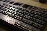
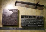
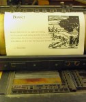
Here’s where Jamie Lee Searle comes into the picture. There are more translators available for hire in the the EU for reasonable rates than the US, go figure, and most based in the US are busy academics so I had some research and inquiries to make before I could even approach someone I felt competent for the project. While I can’t read German I admired the breadth and selection of titles that Jamie has done and she is quite well regarded by her peers so I sent her an inquiry last October about the project. I am happy to say I will be getting the first drafts in the next few days and hope to have at least some prototype pages to show at Codex next month. I’ve recently acquired the matrices for casting the typeface Weiss in 4 sizes and with luck the Linotype will cooperate and give me 50 good lines as it is bitterly cold outside right now at 6º (-14 C) and it is difficult to convince any of these old cast iron and steel behemoths to perform well in these temps.
Dublin
I’ve also been working on a presentation binding for the last of the deluxe editions of The Heart of Darkness. This binding is for an exhibit at The National Print Museum in Dublin, Ireland which I am happy to be part of along with 24 other invited fine press printers from around the world. There are just a couple copies of this book left in the regular edition and this is the last of the deluxe copies for sale. A good run for a book that was finished 4 years ago and was probably the most fun project that I did in partnership with Chester River Press.
Berkeley − codex
I’ve been working on more presentation bindings/deluxe editions of my most recent books in preparation for the CODEX Book Fair and Symposium coming up in February 8th – 11th where I will be at my table full of Deep Wood Press books. There will definitely be pictures of unique bindings and books gracing this blog in the very near future as these projects near photo worthy stages so please stay tuned.
” Over 200 of the world’s most distinguished book artists and artisans, private presses, and fine art publishers will be exhibiting their work at the upcoming biennial CODEX International Book Fair. This is the largest book fair of its kind in the world today!
There is no better place to find and collect the world’s greatest contemporary artist books, fine press books, and fine art editions than at CODEX. Now in it’s 10th year, CODEX has been acknowledged as the leading International Fine Press and Artist book fair. Exhibitors are coming from Germany, UK, Italy, France, South America, The Netherlands, Mexico, Israel, China, Austria, Poland, Australia, Russia, and Japan. The event also attracts special collections librarians, curators, and private collectors from all over the world. “This is THE place to see the latest work from ‘the best of the best’ “ states Peter Rutledge Koch, Founder of the CODEX Foundation.
Coinciding with the Book Fair is a two-day CODEX Symposium that takes place at the Anna Head Alumnae Hall in the mornings before the Book Fair on February 9 & 10. “
– see you in Berkeley at CODEX, come join the madness!
Seattle − workshop & lecture
I’ll also be teaching a workshop and giving a couple talks in Washington state immediately following Codex on February 12th – 16th. I am teaching a workshop for the Seattle Book Arts Guild on the 14th & 15th from 9:00am-5:00pm Reduction and Multi-block Color Printing with Linoleum Blocks for Letterpress at Pacific Lutheran University, Tacoma, see here for contact information. I’ll be giving a talk which will be an overview of the evolution of Deep Wood Press over the past 23 years for the Guild on the 12th and also at the University of Puget Sound on the 13th.