The Intruder – wrapping up the text runs

Tags

, , , ,

Monday was spent puzzling out details on cover treatment and bindings for the regular and deluxe edition of the forthcoming release of The Intruder. The deluxe binding will be done with a calf vellum spine, lightly tooled and spine title, with a still undecided paper finishing the quarter binding. It will be housed in a drop spine box with an additional set of the five big wood engravings done by Jim Westergard. The regular edition will be quarter bound in cloth and paper, possibly cloth and cork – I’ve sent off for samples of something that might work and have inquired about the archival nature of its construction. Might be interesting, reminiscent of a flyrods grip perhaps….

Sage fly rod

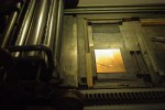
Today was spent finishing the tonal background press runs for the last two big wood engravings. Finally I can put another color of ink on the Vandercook. In order to print the backgrounds in such a subtle color the rollers first had to be purged or any ink that had found its way into the crevasses and pores of the rubber. Half a morning later of inking the press with white ink and a dab of putz and then cleaning it off again three of four times did the trick.

After the tone runs we printed the last page of the book text. Still have a couple pages of the foreword, colophon and title page to go so certainly not done with the black ink yet but closing in.

Video

Tonal backgrounds for artwork

Tags

, , , , , ,

For the center spread we did for Joseph Conrad’s “Heart of Darkness” I needed access to a bigger press. A friends shop has an old Kelly 2 press in Charlevoix, MI about 40 minutes away. The sheet is 35.5 x 12″, a little too big for any current letterpress at DWP.

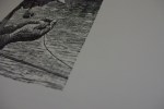
I hand inked four 16 gauge copper plates and arranged them on a template on my BAG intaglio press to get the background tones you can see already printed on the sheet. This process has a few benefits – it crushed the fibers of the Hahnemühle Biblio paper stock leaving a smoother surface for the artwork press run, the subtle color adds compositional frames around the artwork on the large page spread, and this process leaves a nice plate mark from the incredible force exerted by the intaglio press.

Today I was shooting for a similar effect but via all letterpress instead of intaglio for the background tone. I tried several ink combinations but in the end I used my own formula of a medium weight linseed oil, just the smallest dab of raw sienna and some other ink body modifiers. Once again I used copper plates but this time mounted them to type height (.918″) and ran them on my Vandercook OS 219.


That’s Dale from Seely’s running the beast and me at the delivery end checking sheets.