
Tags
Chad Pastotnik, design, fine press books, graphic-design, illustration, intaglio prints, Letterpress, pop-up book, Punch Cutters, Type Castors, Type Founders, Typographic history
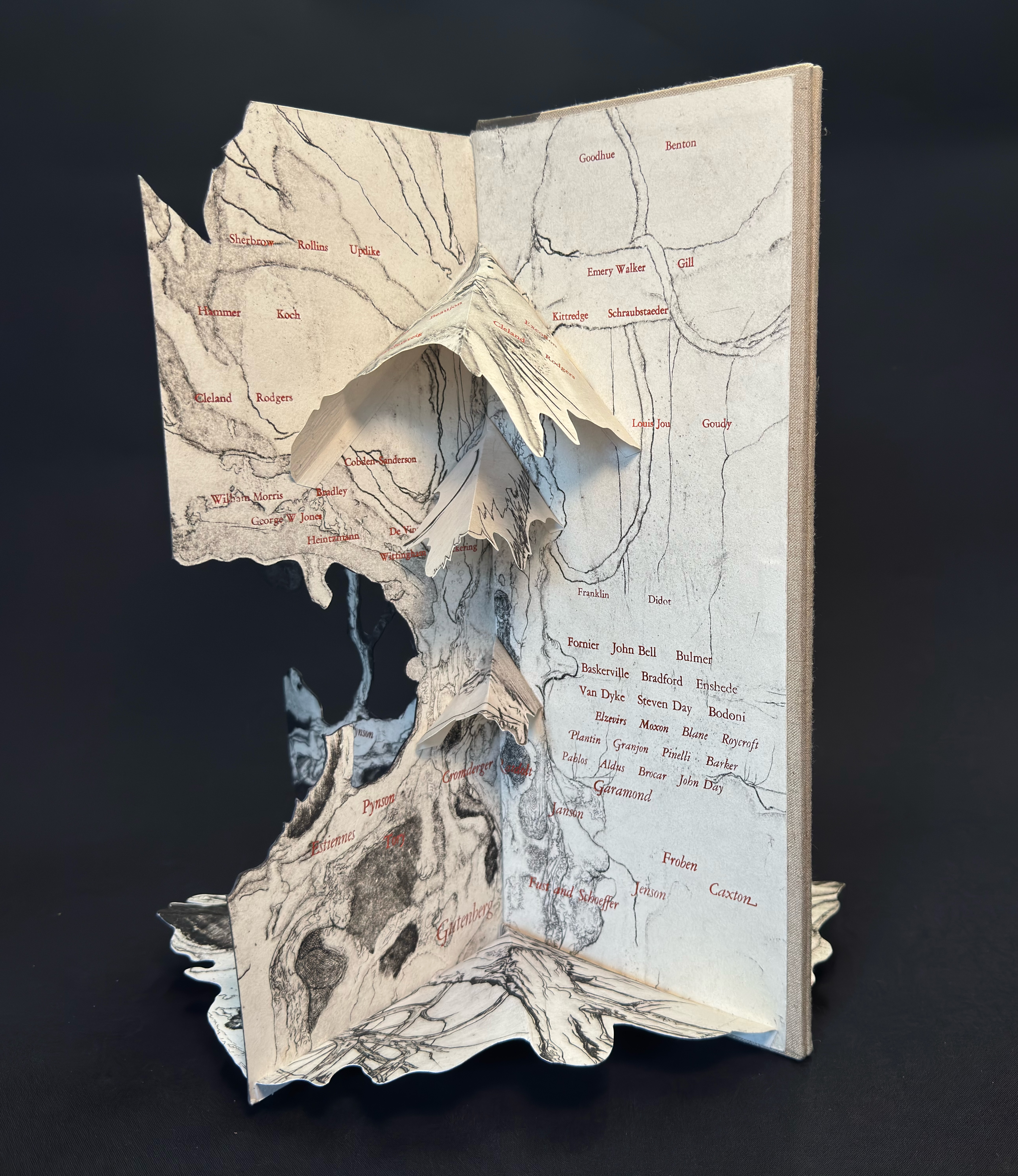
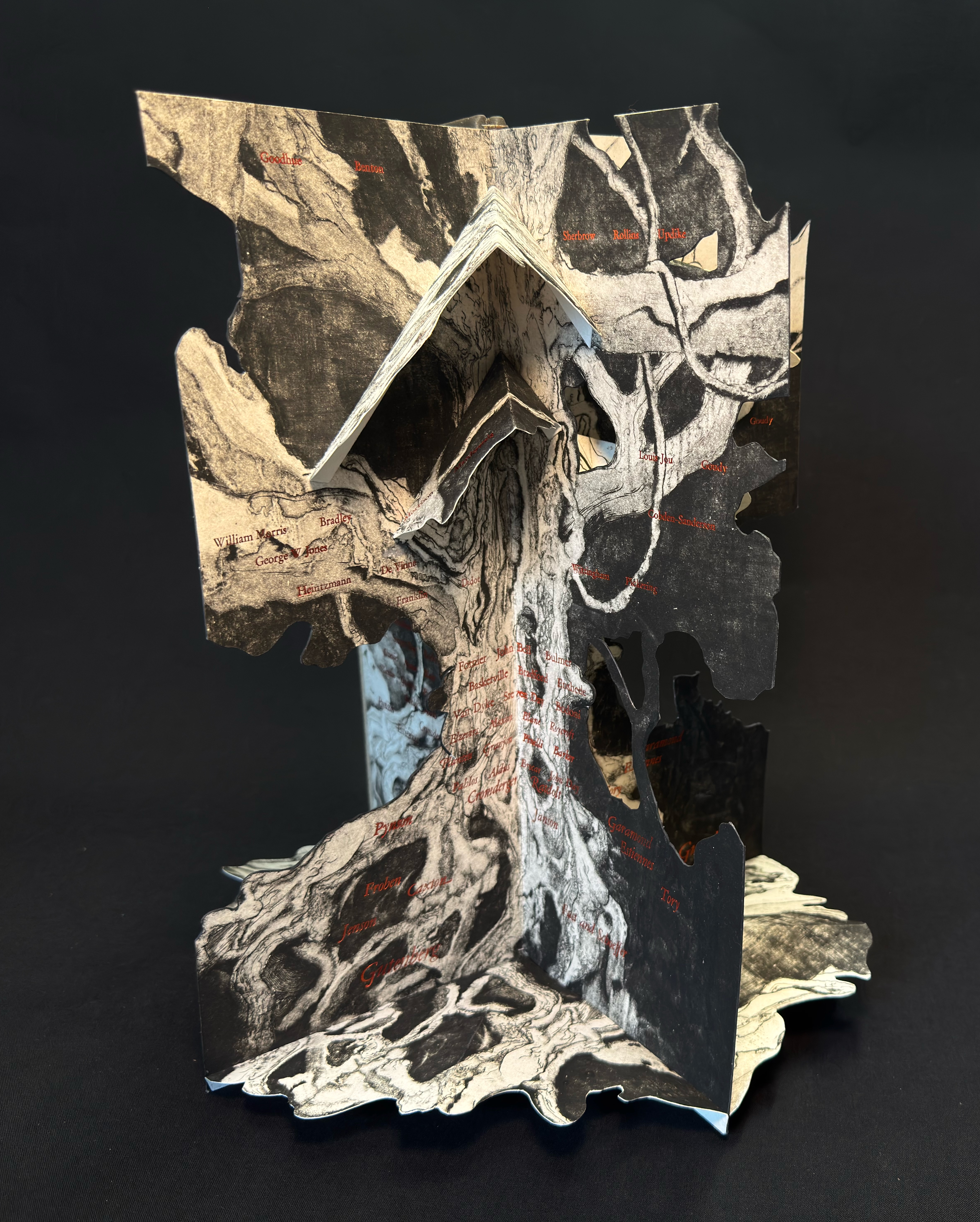
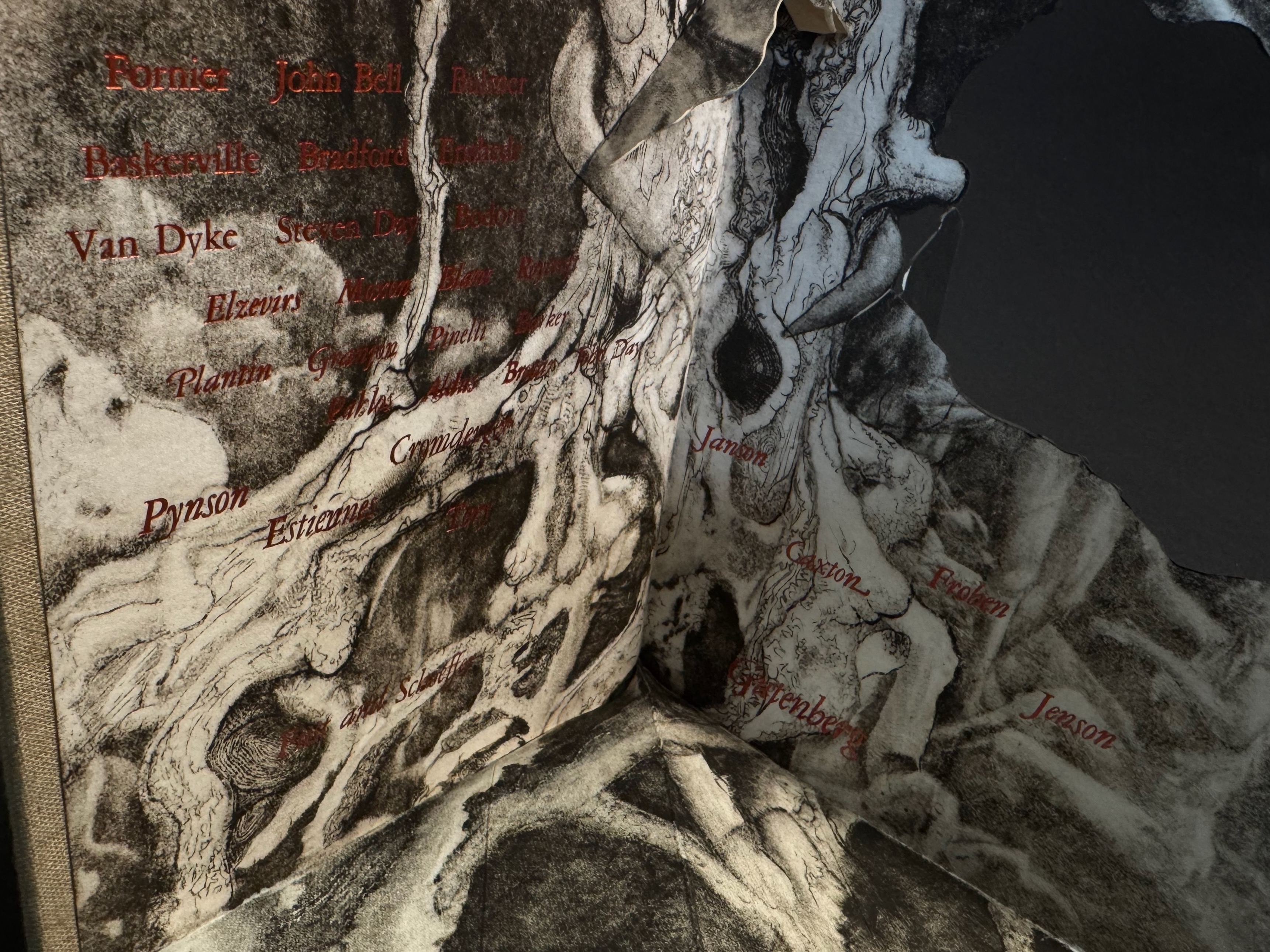
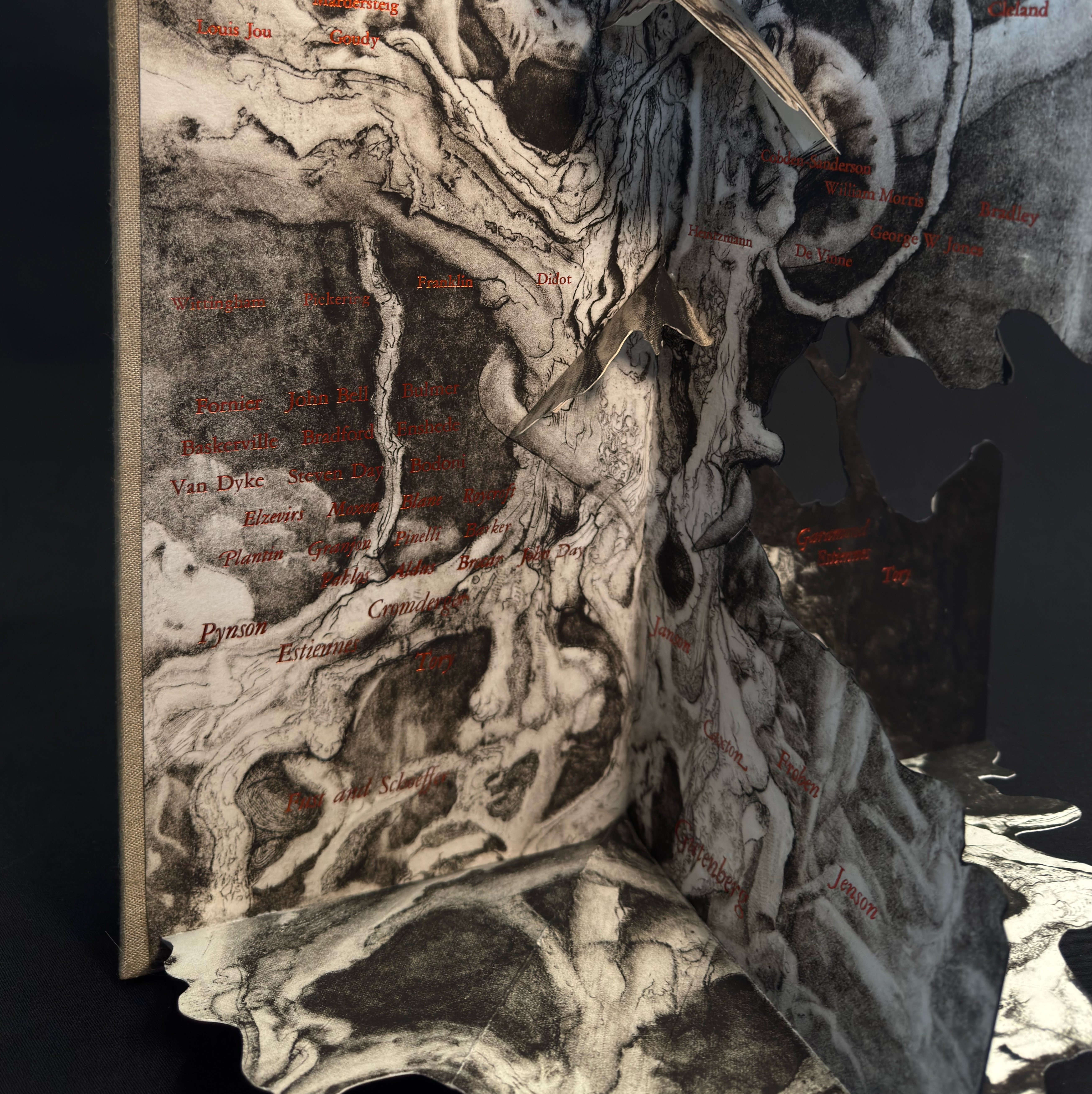
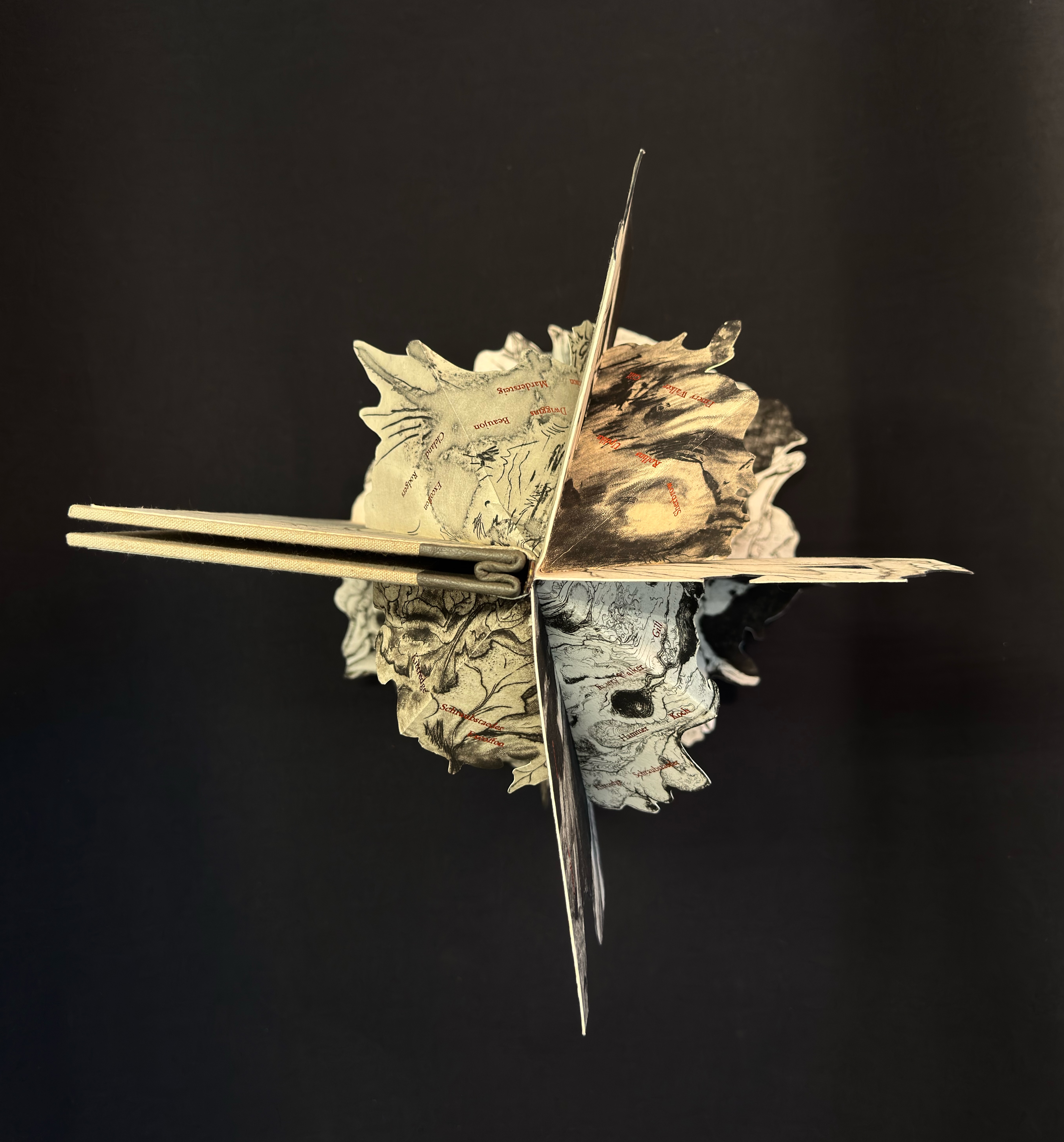
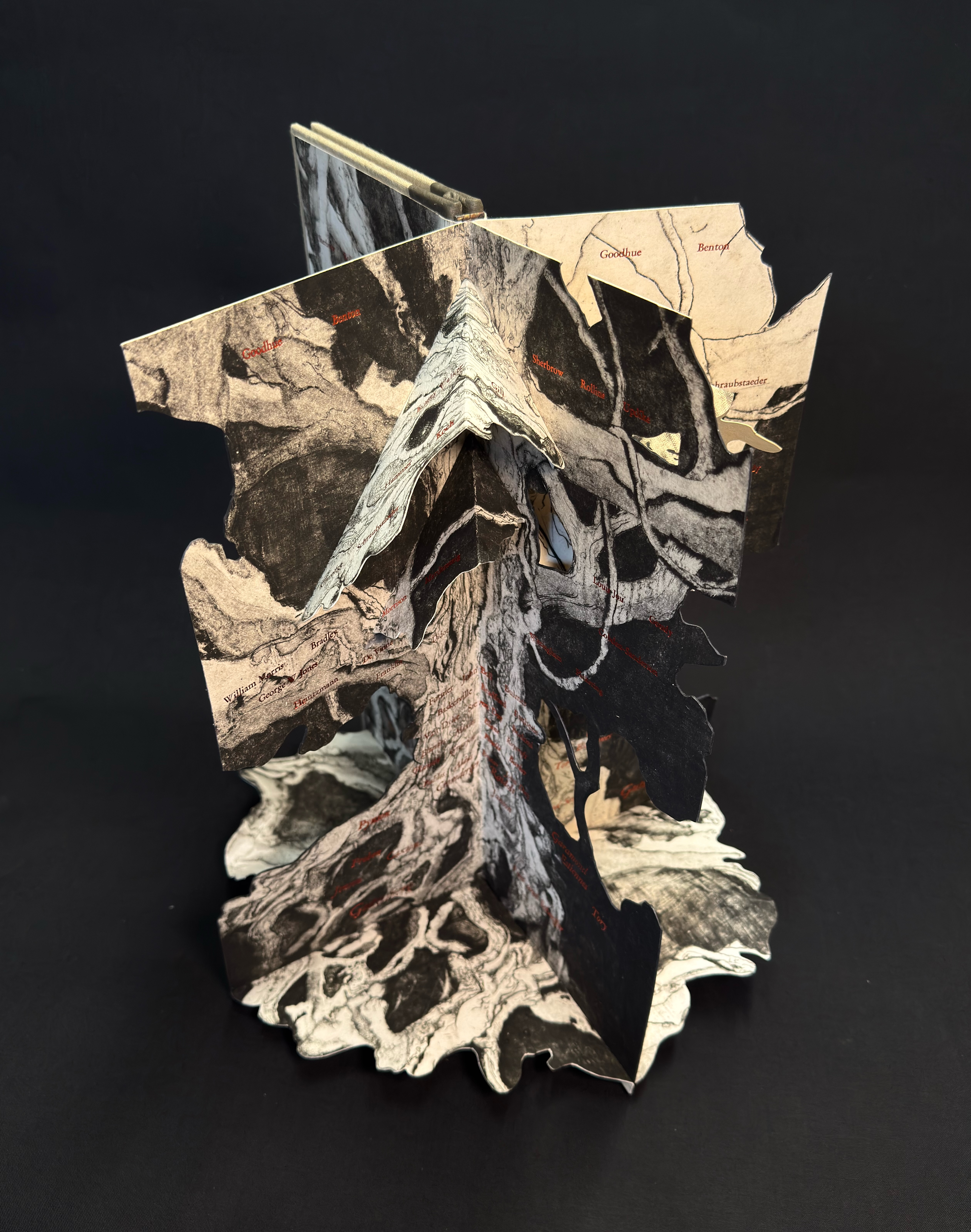
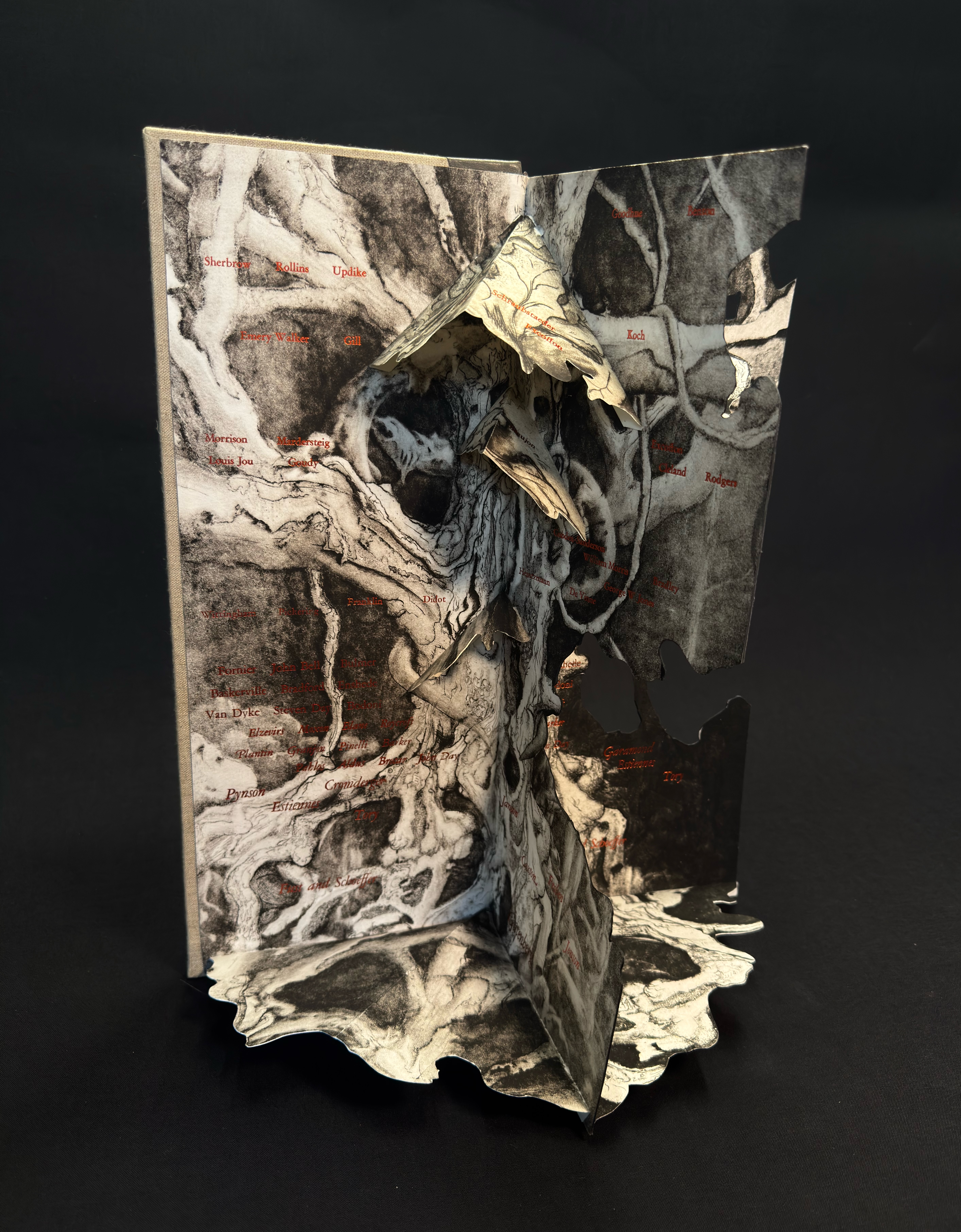
A year ago I presented a first draft of this project and I’m pleased with the progress of my 360 degree wrap around pop-up structure depicting a curated history of typographic luminaries. From Johannes Gutenberg to Linn Boyd Benton this is an attempt to create a loose family tree tracing innovations in type design, type cutting and type founding from the 14th to early 20th century.
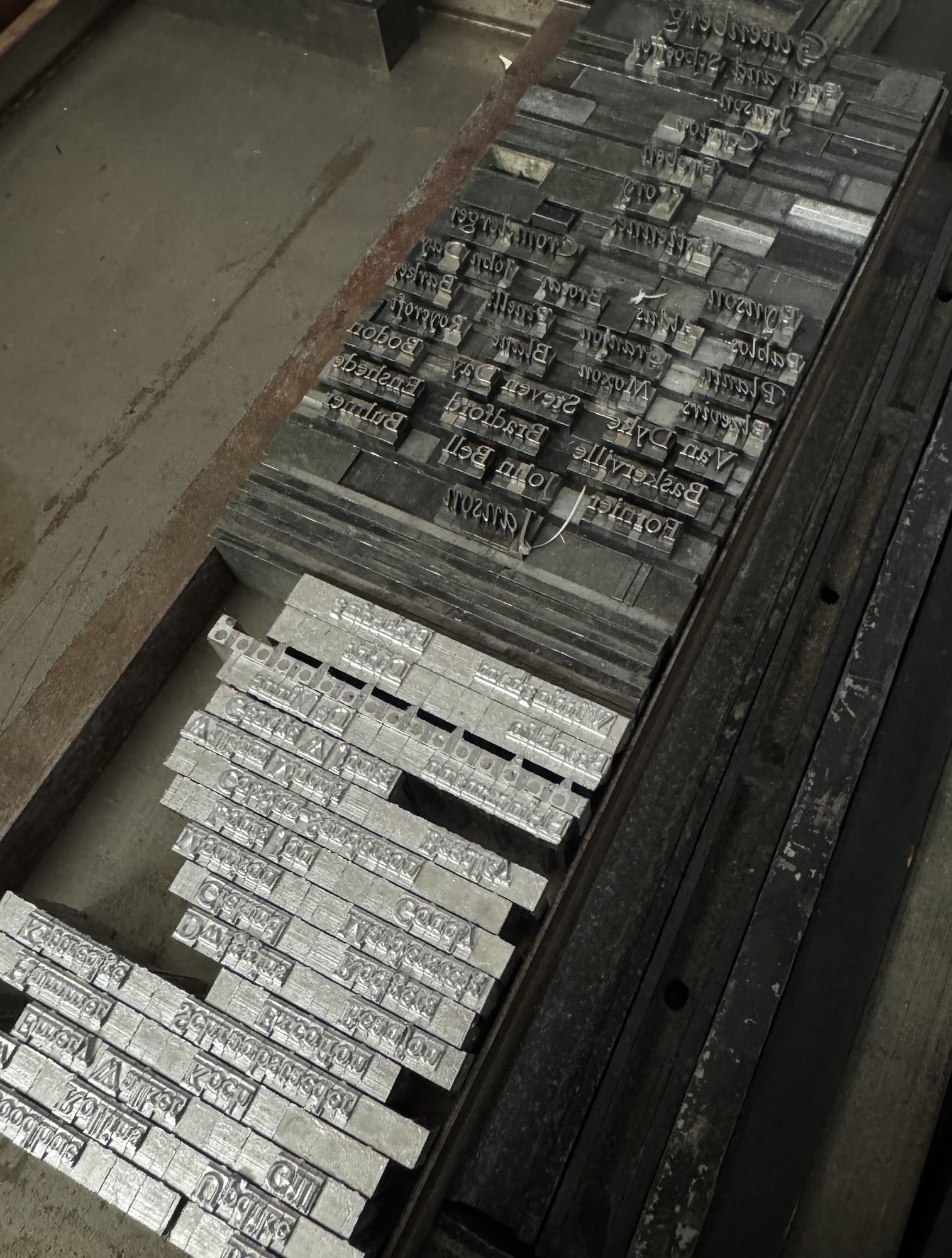
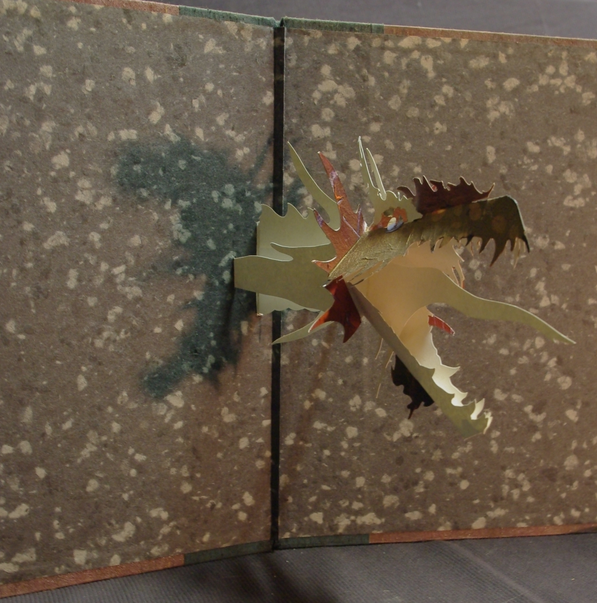
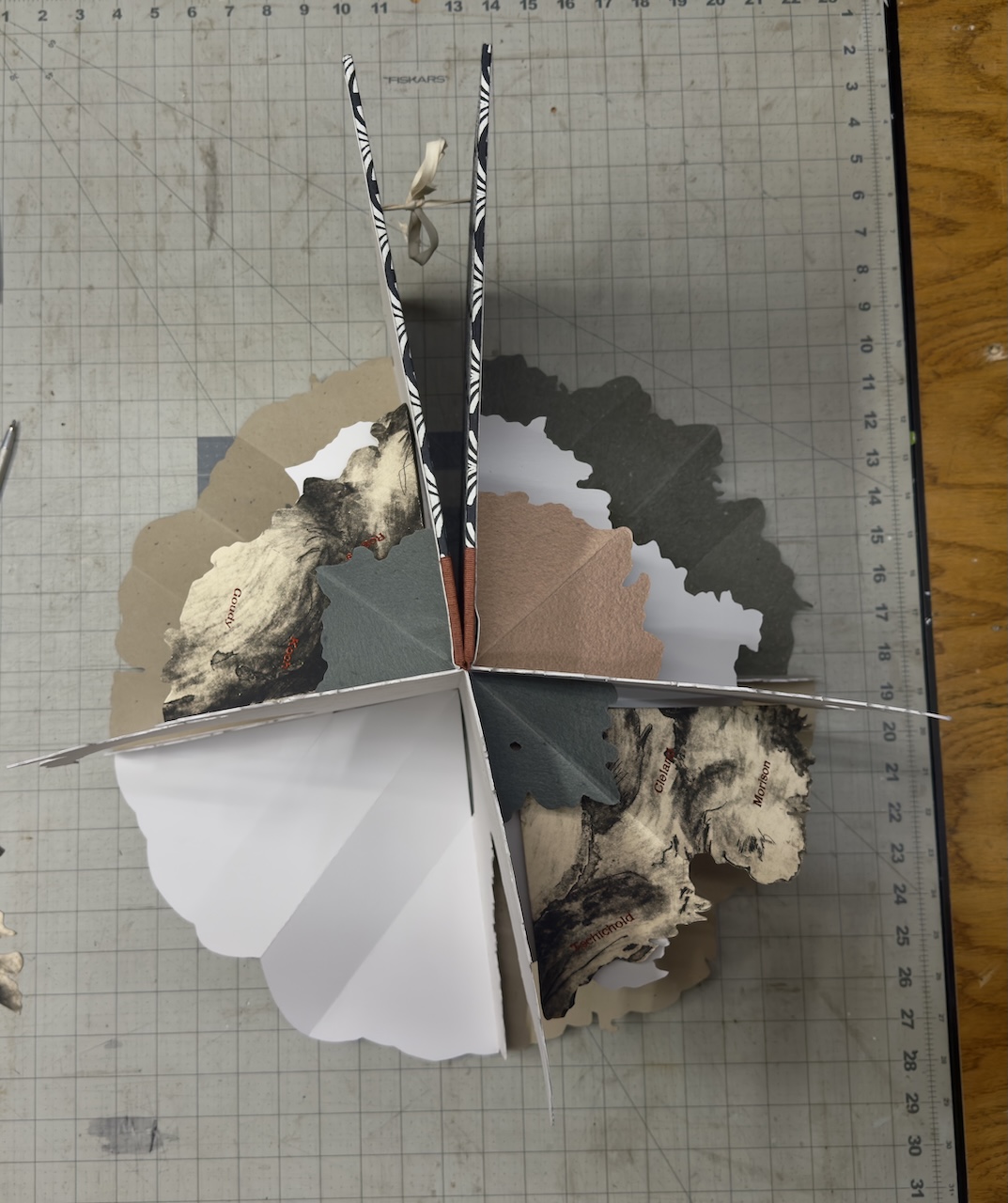
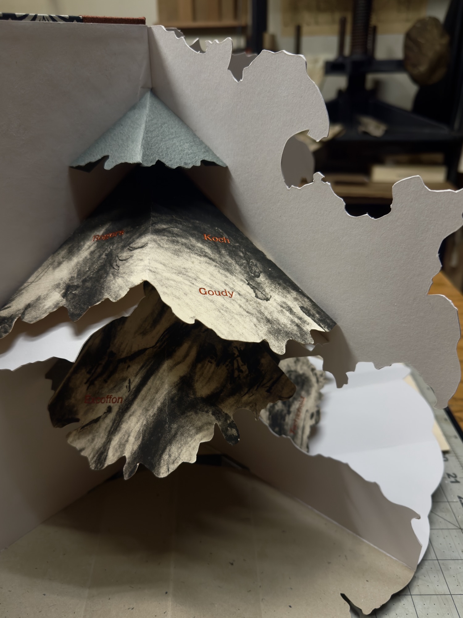
Going through my old copper plates I noted the symmetry of the tree on this 12 ¾ x 15 ½” (31.5x39cm) image and after I found my old proofs I immediately started cutting and folding them up into this kinetic structure. This is one of my intaglio prints that had long languished in an unfinished state when I frustrated myself with the addition of some figurative work. The first layer on the copper plate was a shallow etching but then fully worked over with mezzotint, stipple and hand engraving. The seventy names composed in Garamond and foil stamped in copper start with Gutenberg at the roots and the names chronologically ascend up the trunk and branches in some semblance of order and influence. Each quarter when fully opened includes the full list for viewing at any angle. The type is either hand set or cast on my Linotype machine for 14pt and under, the copper foil catches light nicely against the impossibly deep blacks of the mezzotint. The book requires six copies of the print for each edition, another labor of love with umber/black coarse hand made intaglio ink.
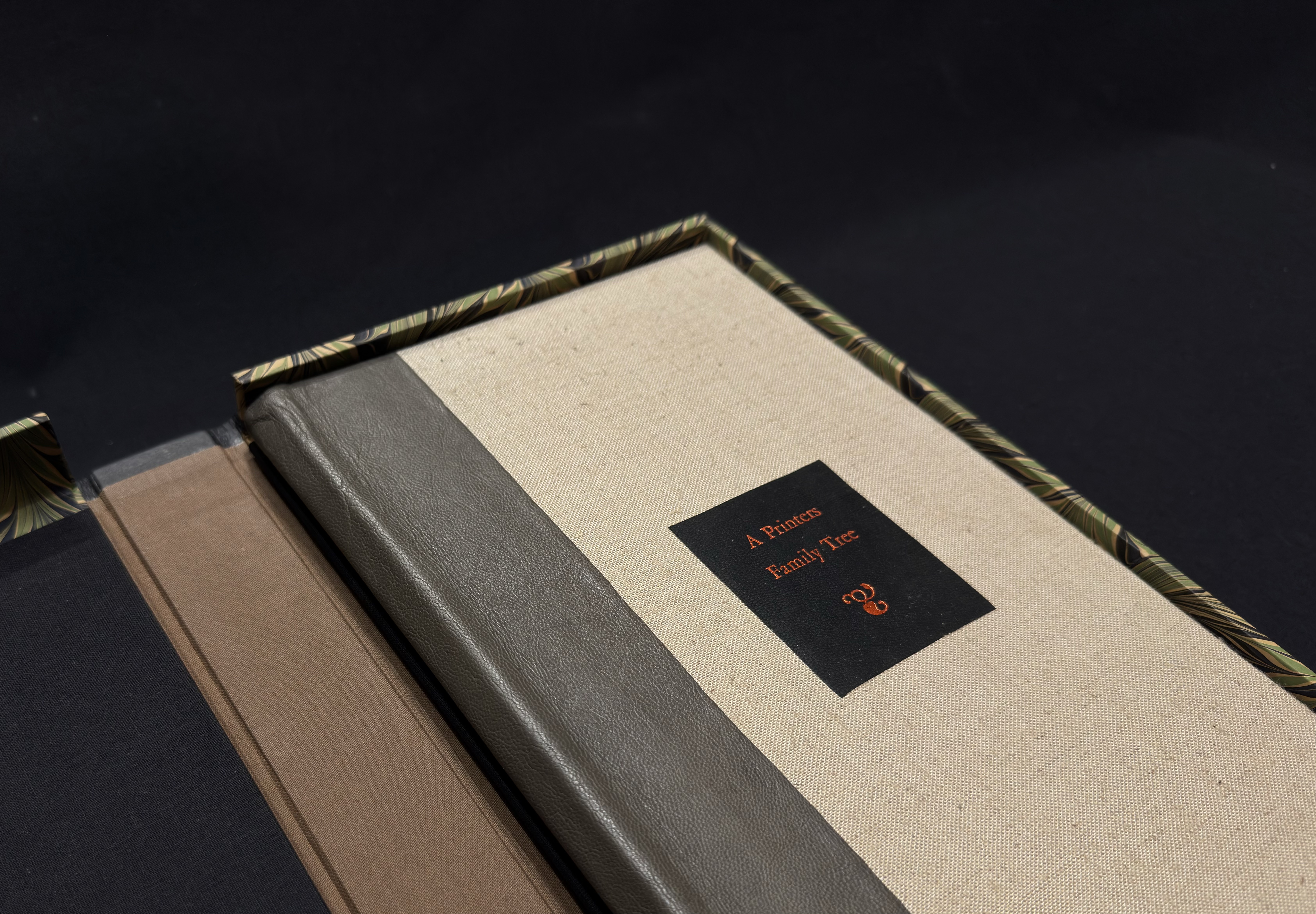
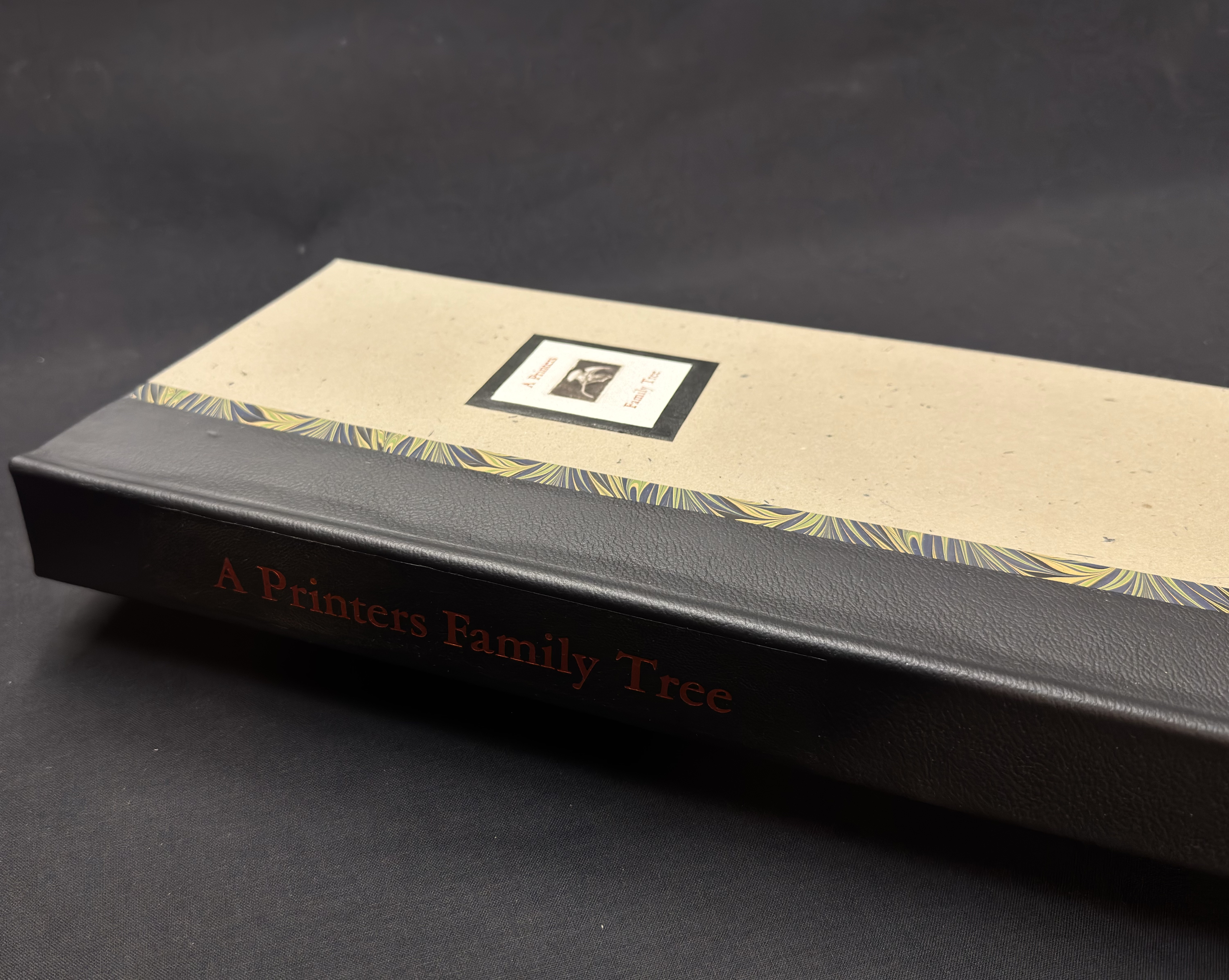
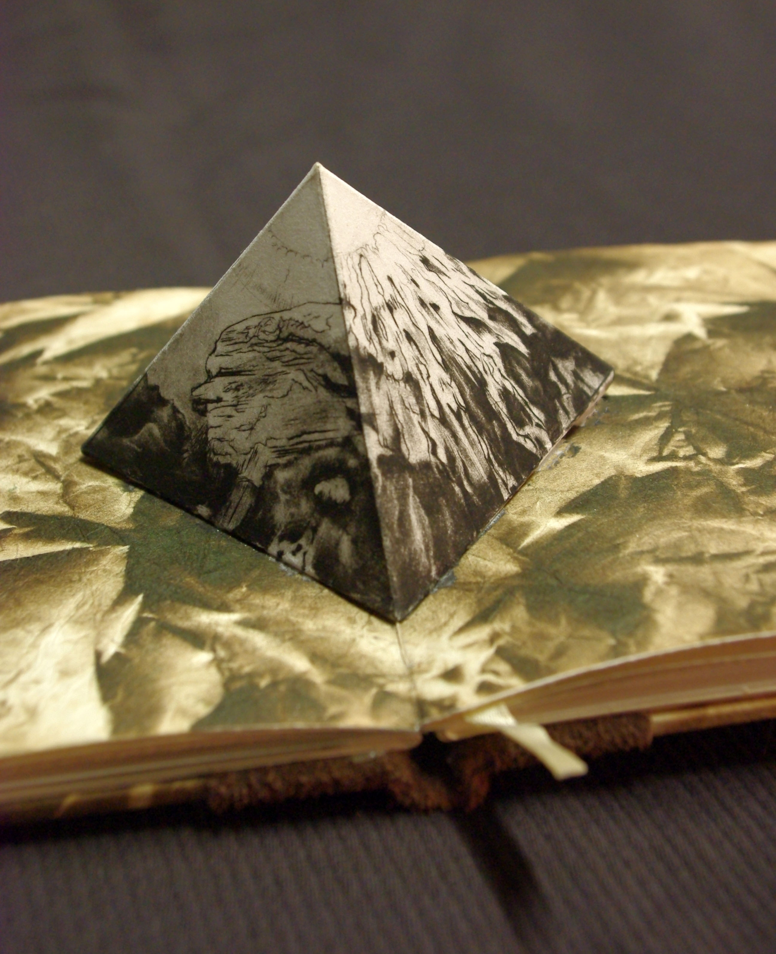
The book is covered in Asahi linen book cloth with a grey French Split goat skin on the spine. The book cover title is foiled in copper on black goat skin. It is housed in a solander box covered in Twinrocker Rustler paper with a black pebble grained goat spine foiled in copper which has a title on the cover that is, again, foiled in copper with another one of my small intaglio prints of a leaf and framed within a black goat border. The sidewalls and cover element are covered in Cockerell marbled paper I’ve been hoarding since Heart of Darkness. The box is 7 ¼ x 16 ¾ x 1 ½” (18.5×42.5x4cm)
I consider this the final Beta. The next version will have additional intaglio work on the main plate with new plate “wings” extending the width of the book as I prefer the dimensions of my previous prototype. I also have some more names I’d like to add as there are some mid to late 20th century individuals I feel need representation. There will also be structural improvements, I embedded magnets in the cover boards to hold it fully open but not enough of them to be successful!
This book will debut along with my new Mornings at Jack Pine at the Manhattan Fine Press Book Fair coming up very soon on May 2nd. I’m committed to making 5 additional copies and will start taking deposits for those on my return from New York.
$8000.00
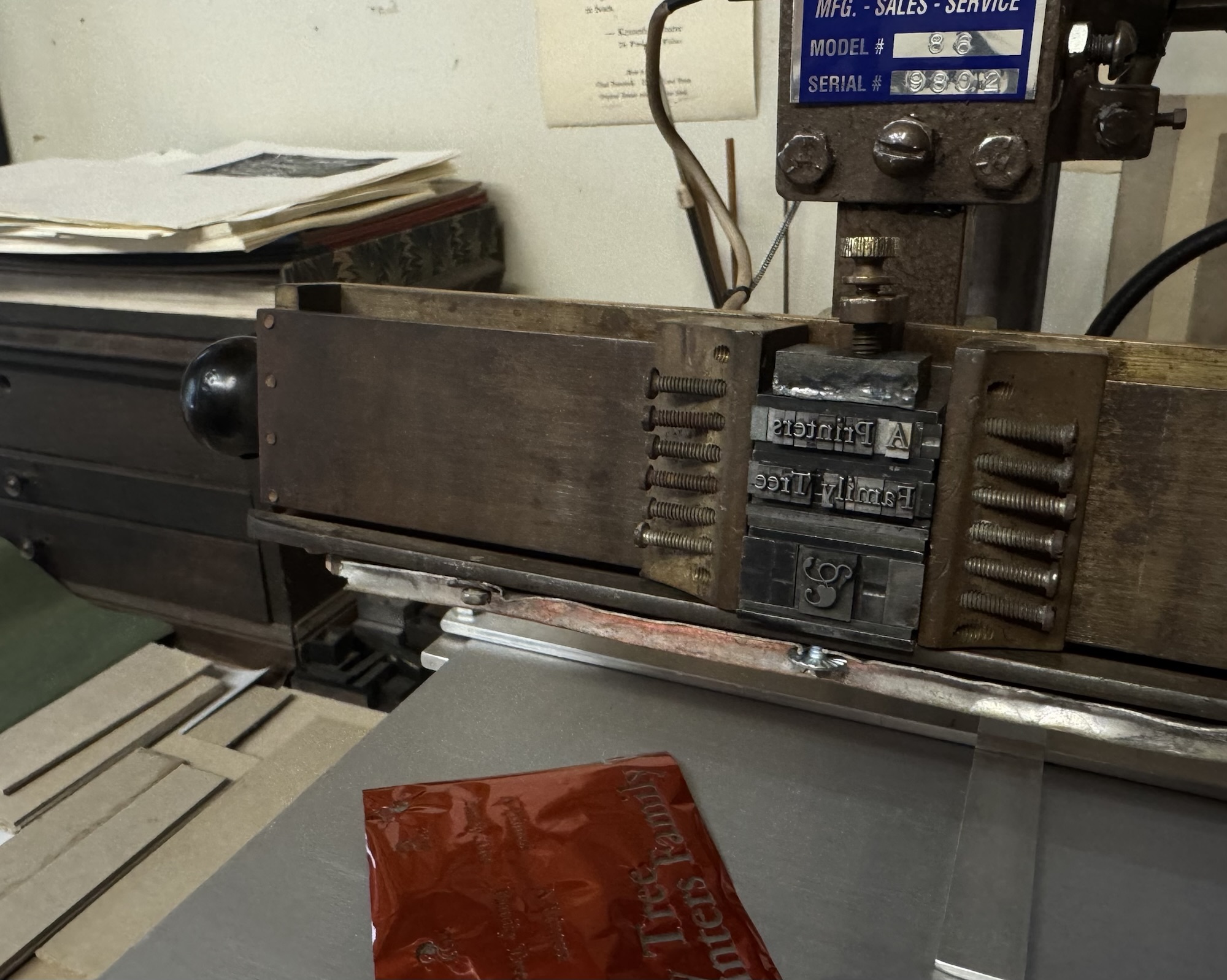
Those of you who know me know my views on the contemporary “fine press” book scene. Conceptual ideas in small editions run rampant but often at the expense of craft and frequent ephemeral topics. I was making things like this 35 years ago when it was inconceivable to solicit such things to institutions while at the same time trying to achieve what I considered the pinnacle of fine press – books with words, lots of them and in proper bindings. A Printers Family Tree is my offering to the book arts gods incorporating traditional intaglio, letterpress, type casting and book binding as a tribute to the great individuals who came before who have influenced, informed and made possible my means of existence.
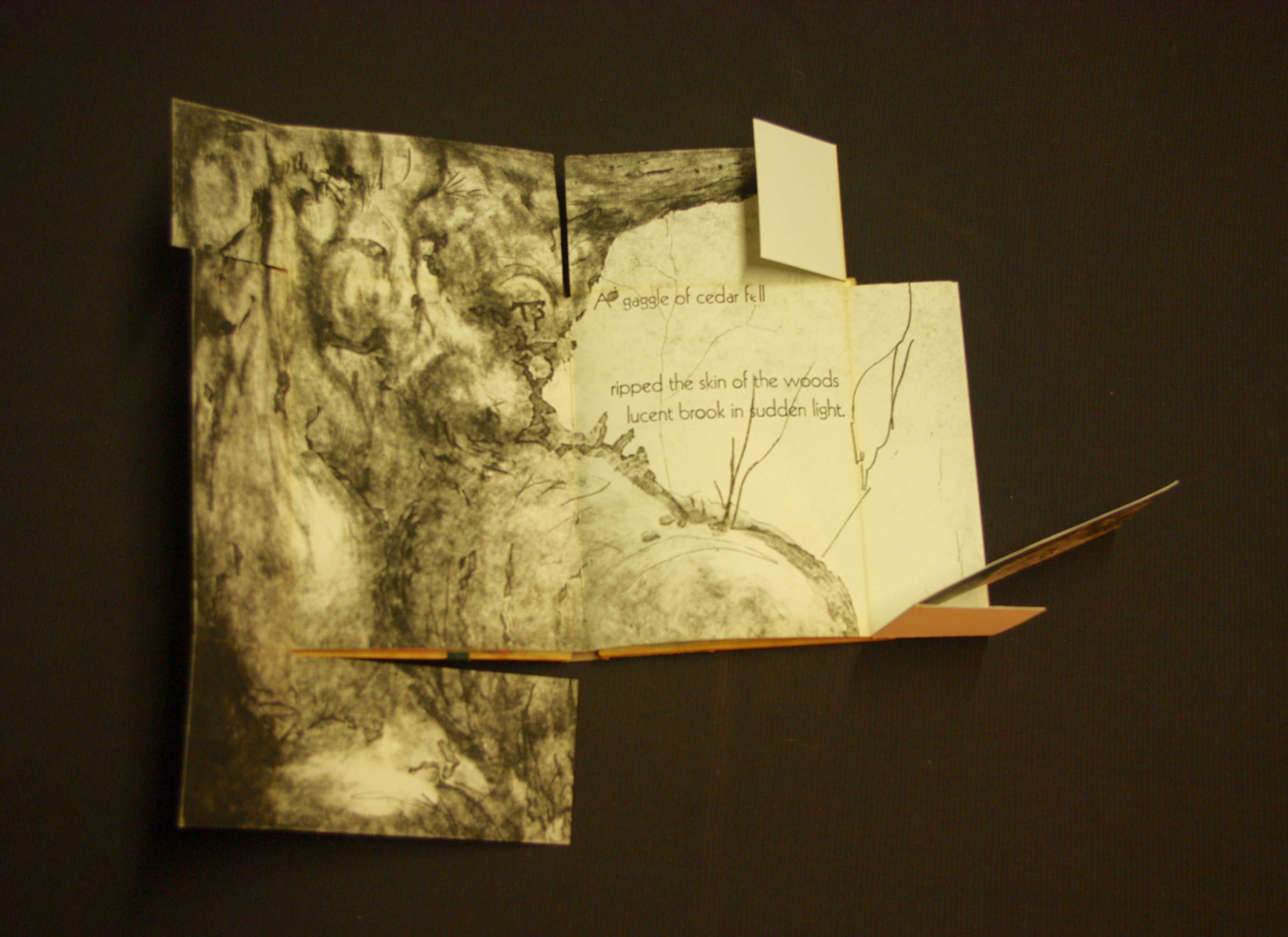
Some early attempts at folding and pop-up structures from 1994-2000 and last years prototype.
